7 tips for a visual merchandiser
7 Tips from a Visual Merchandiser, Ilaria Gasparo works as a VM for Bershka, and has a lot to share!
Giulia: Can you explain to me what exactly your job consists of?
Ilaria: I’m a Visual Merchandiser. Therefore, I am in charge of everything related to the image of the store. From shop windows, mannequins, lights, internal layout, to marketing material and props and so on. I will explain to you in general what is going on in the retail field. I will also provide you with 7 tips from a visual merchandising, which is a role that can vary from company to company. In general, the VM is the one responsible for securing the best experience possible for the customers in the store. Balancing the commercial needs and the image of the shop/brand.
Giulia: What is the aim of a shop window?
Ilaria: The shop window is like the business card of a store. Through an effective window display, the brand can get to the streets and attract the attention of passers-b. So, it allows communicating inside out, sending messages regarding the brand philosophy, image or simply commercial actions. In today’s ever-changing retail landscape, the window display is getting more important every day, but at the same time, attracting the attention of the over-stimulated and hyper-aware consumers is becoming harder.
Giulia: I understand so that means that it is really important that the outside feeling, that attracts the public, is consistent throughout the spaces around the store?
Ilaria: Yes, of course! Once inside the store you have to keep the customers entertained in a coherent and original way, balancing visually charged and strong aesthetics with blank spaces. In fact, the negative space inside the store is as important as the full one, to strengthens the message you are trying to convey. Another important area, at least when talking about clothing, is the changing rooms: data shows that, for most customers, this is the most dreadful moment of the shopping journey, even worse than the payment phase!
Giulia: Technology is helping in that direction, right?
Ilaria: Today retailers are implementing the use of technology. Mainly, to improve the experience in the dressing rooms, filling in the gap between offline and online experience. Last but not least, the payment: the last thing our customers will do, and a moment of recollection of the shopping experience itself. A huge trend in the past years (exploding in the media with the opening of the first Amazon-Go store) is to de-personalize this last step. Giving the possibility to pay everywhere inside the store with tablets or via their phones. I personally prefer the warmth of human contact during the final phase of my shopping. But from a retailer point of view, human behavior is definitely a variable more difficult to control.
//CUSTOMER EXPECTATIONS
Giulia: How do you manage the famous ‘third-space’?
Ilaria: The ability to become a third space for customers is crucial, the idea of offering way more than just a selection of products, has never been so important. Easier said than done, lots of retailers are still missing out on this concept, since it is a money and time investment with often intangible returns, and most retailers are still reluctant.
To manage a third-space is important to start with a why, why my customers should come to the store apart from buying? This why should be coherent with the target and the brand philosophy, and you must have a clear idea of the feelings you want people to experience in the store and what actions, if any, you’d love to induce.
After having this established I usually pass to the how, which, in my opinion, is the most difficult part. After the design, there is the human aspect to consider: involving every single team member in the process and assure that everyone is working enthusiastically in the same direction to offer the best experience possible. Usually, once you get it perfected it is about time to change and create something new because retail is moving at a crazy speed and it is crucial to be flexible and stay ahead of trends to be relevant.
Giulia: In your personal opinion what type of experience are customers looking for when they go into a store?
Ilaria: The customers’ expectations have deeply changed during the past decade. Todays’ customers are very well-informed, are deeply critical, and their expectations are incredibly high: they do not go to a store to just buy something, they want to be entertained, to receive a hyper-personalized service and to be able to share that experience through social media. In 2020 they want to connect with the brand and with others, feeling a sense of brand community, another big trend in branding evolution. Millennials and Gen Z, in particular, want the brand to be consistent, to share their values and act accordingly.
//VISUAL LOOK
Giulia: Lately, visual excess is becoming a strong trend in retail. I have seen it in several projects in China, carried out by X+living architecture firm, but also in experiential retail such as the Museum of Ice-Cream. How can this hunger for fun be translated into everyday retail?
Ilaria: Yes, I would say that “less is more” is a concept that is losing its charm in retail. All the visual excesses we are witnessing now in stores and interiors designs are trends that are here to stay for a while. Their proliferation is mainly due to Instagram, social media and the minimal attention span of today’s’ consumers. It’s a phenomenon that forces us to always take into, how impactful it is and its Instagram-appeal.
Keeping in mind that it depends on the public we are addressing, the most important thing to consider during the design process is the consistency with the brand itself. To sum it up: the ways we have today to offer customers the fun they are looking for when shopping, are pretty endless; the crucial point is to deploy the one that best speaks to your customers and that best represents the values of your brand.
Giulia: When designing a shop which are the visual characteristics that we need to take into consideration?
There are 5 elements that are crucial when designing a shop and a shop-experience:
- colour, the key is to attract and focus the attention of the customers,
- light, for the practical reason of showing properly the products but also to transmit contracts,
- materials, a “special” visual element because it trespasses into the sense of touch,
- shapes, this element also transmits a sensation to the customers. And of course, the heights of the displays, the ceiling, the mannequins also play a crucial role,
- layout, of the furniture we want to use, of how we want to differentiate the areas of the shop. This determines how we want the customer journey to be.
Giulia: Pop-ups are becoming a natural touchpoint of the retail experience. In your opinion which are the characteristics that pop-ups must have in order to be visually appealing?
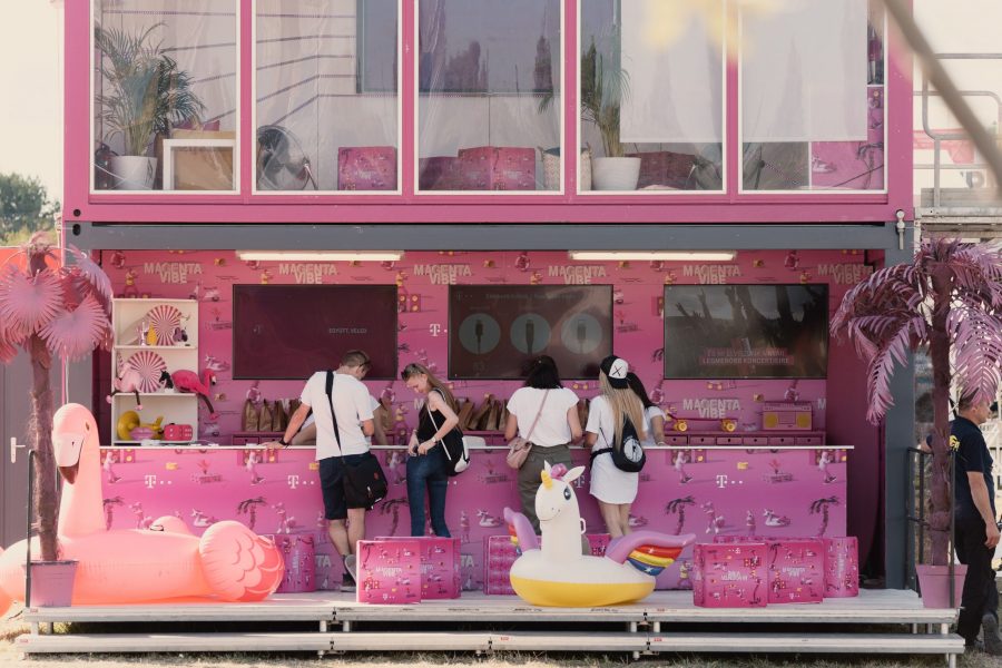
Ilaria: Pop-ups have been a huge trend for the past decade. Even being around for quite long, it’s a retail format that never fails to surprise me. It’s a temporary format, the purposes are usually more image-related and data collection-related than connected to concrete sales targets. Also, for this reason, it is a retail solution that gives lots of freedom to creativity. I see it as a way for the brand to say: “We are amazing, we are here today! So let’s come in, maybe tomorrow we won’t.” Therefore, the store must be eye-catching (both for excess or for lack of excess, depending on the location), visually “loud” somehow. A common solution in pop-ups is, for example, the use of words. The deployment of catchy phrases, funny jokes or questions in the windows or the façade of the store, is an effective way to intrigue the passers-by. Another vastly used solution is to create something shockingly different from what it used to be there before or to all the surrounding aesthetic of the street, square, neighborhood.
There are loads of different ways to catch the eye of a potential customer, but the main things to keep in mind when thinking about the visual aspects are: make it different but stay coherent with your brand and your message.
Giulia: Which is the best retail experience you have had and why?
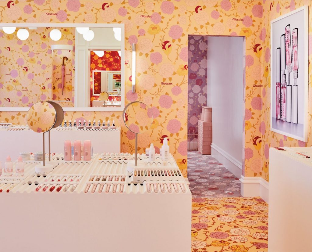
Ilaria: The first one coming to my mind, and the most recent one, is the Glossier shop in London. They opened a pop-up at the end of 2019, Located in Covent Garden. It breathes Glossier in every detail. The iconic Glossier millennial pink colour is nicely mixed with floral patterns on the walls. Every room has a different main colour and different flowers. The visual impact when entering the store is nothing but WOW! The all-pink-dressed and smiling sales assistants will then take you along the whole shopping path. Let you trying the products and guiding you in a world of serums and cleansing foam. The products in the store are just displayed testers. You can try them, but you’ll receive your own purchase from the stocking room a few minutes later. In a nice flowery bag with your name on it, kind of like in Starbucks, but without the misspelling!
Being a fan of the brand I enjoyed the way the store and its aesthetics spoke to me in a coherent way. The colours, lights and the sense of sharing an experience with the (mainly only) girls who were in the store. I’ve loved the experience!

Photography: Courtesy of Glossier
Giulia: Besides the 7 tips from a Visual Merchandiser point of view, in your personal opinion, which are the trends that we will see in 2020 when it comes to the retail and visual display in retail?
Ilaria: I think the next year we are going a growth in trends already noticed in 2019. I am thinking about:
- sustainability and the whole environmental issues connected to fashion and retail in general,
- augmented reality as an integration of the shopping experience,
- retail automation, same-day (or same-morning) delivery.
A growing phenomenon, from the display point of view, is the rise of pop-ups-store inside a store. Using irony and humor is also going to stay, as never as today, we need to smile. We are also going to see more contrast between bold colours, and in general, everything which is contrasting. Raw and unfinished materials versus plain and defined ones. The contraposition between old and new styles and designs, matching and merging to create new concepts. Arts in the store: pieces of art or elements that strongly remind them.
//7 TIPS
So to sum up, these are the 7 tips from a Visual Merchandiser:
- Negative spaces are as important as the full one to create a balance to allow your message to convey.
- Pay special attention to the most dreadful moments of the shopping experience: dressing rooms and payment.
- To implement the third-space you must start with the why. Why should my customers come to the store beside buying?
- Flexibility is crucial to stay ahead of trends and surprise your customer
- Never underestimate customers, they are well-informed, deep critical and expectations are extremely high
- More is more! how impactful what we do and its Instagram-appeal must always be taken into consideration.
- When planning a layout of a store keep in mind: colour, light, material, shapes, and layout.
Wow, there is a lot going on in the world of retail. And all these 7 tips from a Visual Merchandiser are insights that can be applied to pop-ups or events. Ilaria is a brilliant Visual Merchandising but also writes a blog called Retaily about the trends in the field of retail.


